Modernizing Auto Refill Portal
Redesigned Fullscript's highest-leverage retention surface into a clear, intuitive experience that patients could navigate without support.
Role
Senior Product Designer
Timeline
3 weeks
Team
2 FEDs, 1 BED, 1 Designer
Scope
1st to 4th Order Patient Conversion
My Role
- Led discovery research to map existing IA and identify friction points
- Facilitated concept reviews with stakeholders to align on scope
- Owned data collection and analysis to validate design decisions
- Partnered closely with engineering on implementation approach
- Owned Design QA using AI tools and pushed MRs directly to codebase
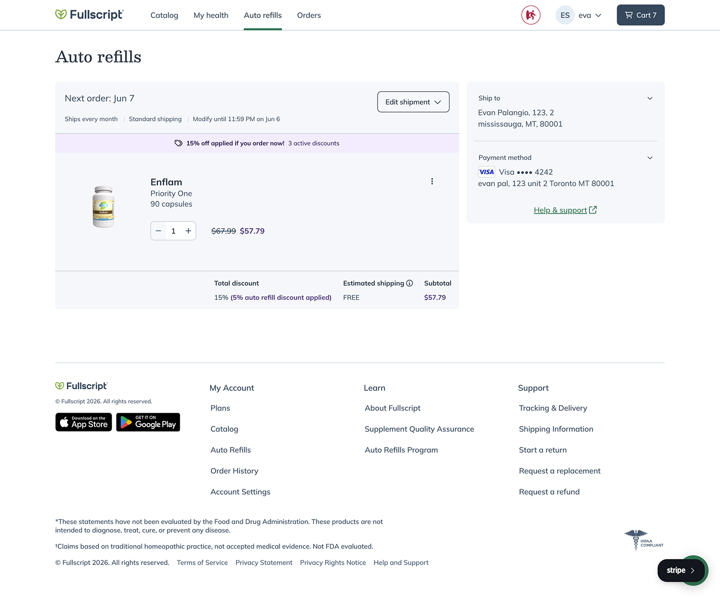
Before: Portal
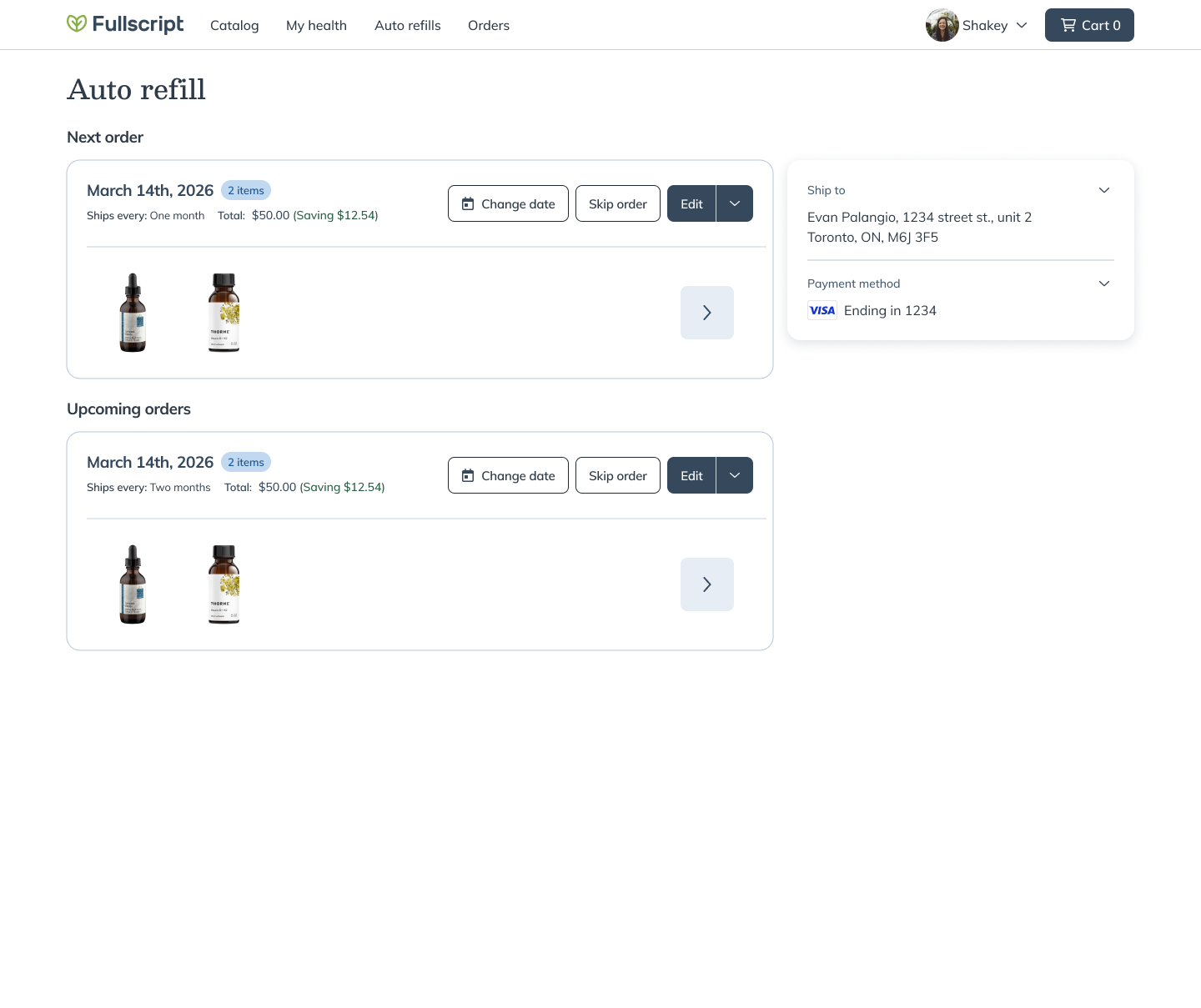
After: Portal
Problem
Patients couldn't answer three basic questions: What's shipping? When? Can I change it?
Approach
Resisted feature creep. Scoped to IA and layout only. Promoted skip/reschedule as alternatives to cancellation.
Outcome
Lifted activations 11%, cut cancellations 3%, halved support tickets, generated ~$600K in incremental revenue.
Incremental Revenue
From activation lift alone
Context & Problem
Business Context
Auto-refill is one of Fullscript's highest-leverage retention surfaces. The web portal had accumulated years of drift: dated visuals, fragmented IA, and patterns that made routine edits feel foreign.
User Context
US patients managing supplement subscriptions who needed to view, modify, or pause upcoming orders without confusion.
Constraints & Complexity
Goals & Success Metrics
Objective
Deliver clarity and reduced complexity, creating a foundation the team could build on for future experiments.
Success Criteria
- Patients can answer 'What, When, Can I change it?' without digging
- Reduce support ticket volume
- Maintain or improve activation and retention metrics
11%
Activation Lift Target
50%
Ticket Reduction
0%
Net Cancellation Increase
Approach
Audit
Mapped existing IA, identified where 'view upcoming' and 'edit subscription' flows were scattered.
Scoping
Resisted feature creep. Deliberately narrow MVP focused on IA and layout only.
IA Rework
Made 'view upcoming' and 'edit subscription' the dominant entry points.
Friction Reduction
Promoted reschedule and skip into primary view as alternatives to cancellation.
Staged Rollout
Shipped behind flipper with slow rollout to validate before full ramp.
Key Decisions
Critical choices that shaped the final solution
Decision
Scoped to IA and layout only. Visual refresh could come later once foundation was proven.
Tradeoff
Faster ship, cleaner validation, but portal still looked dated.
Decision
Promoted reschedule and skip into primary view as first-class actions.
Tradeoff
Required rethinking action hierarchy, but directly addressed cancellation driver.
Decision
Shipped behind feature flipper with percentage-based rollout, monitoring at each stage.
Tradeoff
Slower deployment but significantly de-risked launch.
The Solution
A restructured portal that answers patients' core questions at a glance: what's shipping, when it's arriving, and how to change it. Reschedule and skip elevated as primary actions to reduce unnecessary cancellations.
Before: Order Detail
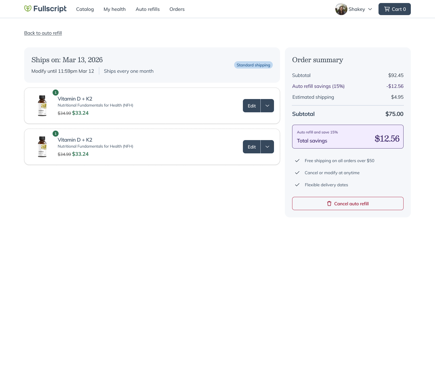
After: Order Detail
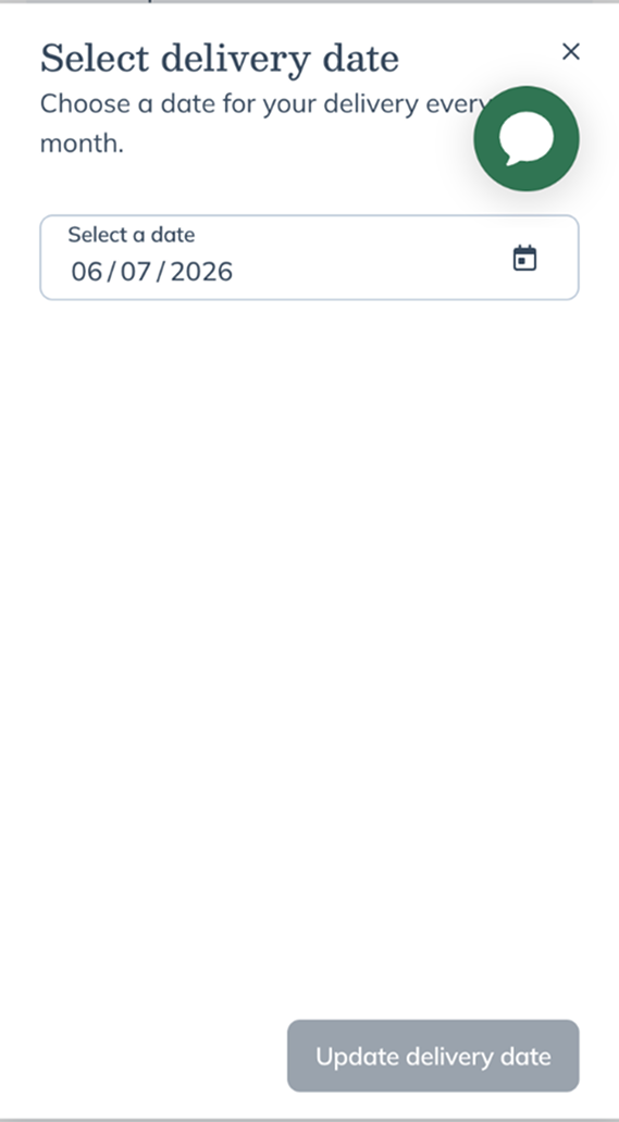
Before: Date Picker
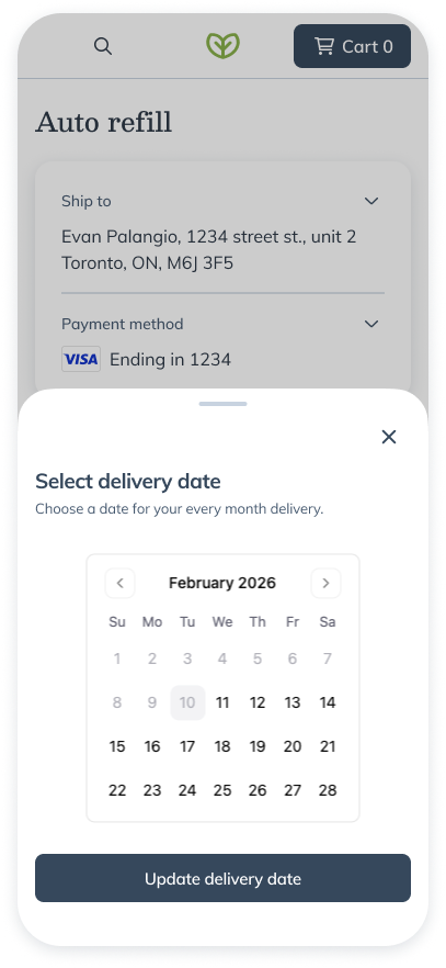
After: Date Picker
Outcomes & Impact
Activations
~2,700 to ~3,000/day from this page
Cancellations
From surfacing alternatives
CS Tickets
~200/week to ~100/week
Revenue Impact
From activation lift alone
Business Impact
The redesign delivered a clean foundation for follow-on experiments: adding products to auto-refills, surfacing recommendations, streamlining management.
User Impact
Patients can now navigate subscriptions without support, with a mental model that matches how they think about recurring orders.
Learnings & Reflection
Resisting feature creep paid off. Tight scope meant cleaner attribution and faster validation.
Promoting alternatives to cancellation directly moved the cancellation metric.
Sometimes the best redesign is invisible. Users don't notice good IA, they just stop struggling.
Building a foundation for future experimentation is as valuable as immediate metric wins.