Patient Overview Page
Built a centralized landing surface that answers 'what's next for me?' — lifting 1→2 order conversion 5.5 points and adding ~$1M/month in 0→1 revenue.
Role
Senior Product Designer
Timeline
6 weeks
Team
2 FEDs, 1 BED, 1 Designer
Scope
Patient LTV and conversion optimization
My Role
- Led and owned UX research entirely — from problem discovery to validation
- Collaborated cross-divisionally with Labs, Providers, and Platform teams to align goals
- Drove IA decisions and information architecture strategy
- Made significant contributions to Fullscript's design system
- Owned experiment design and success criteria definition
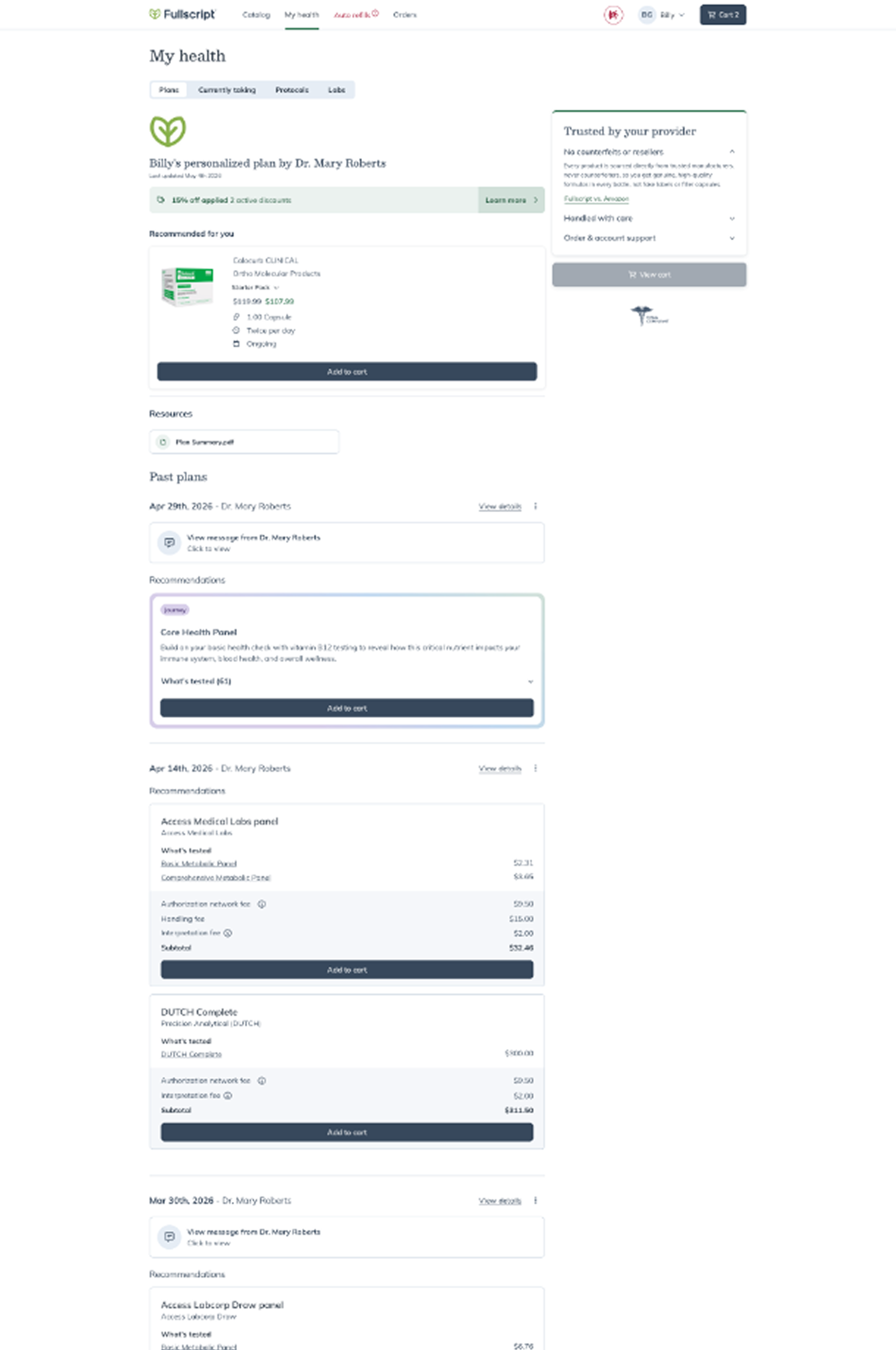
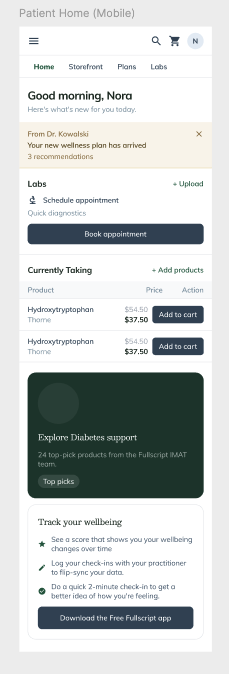
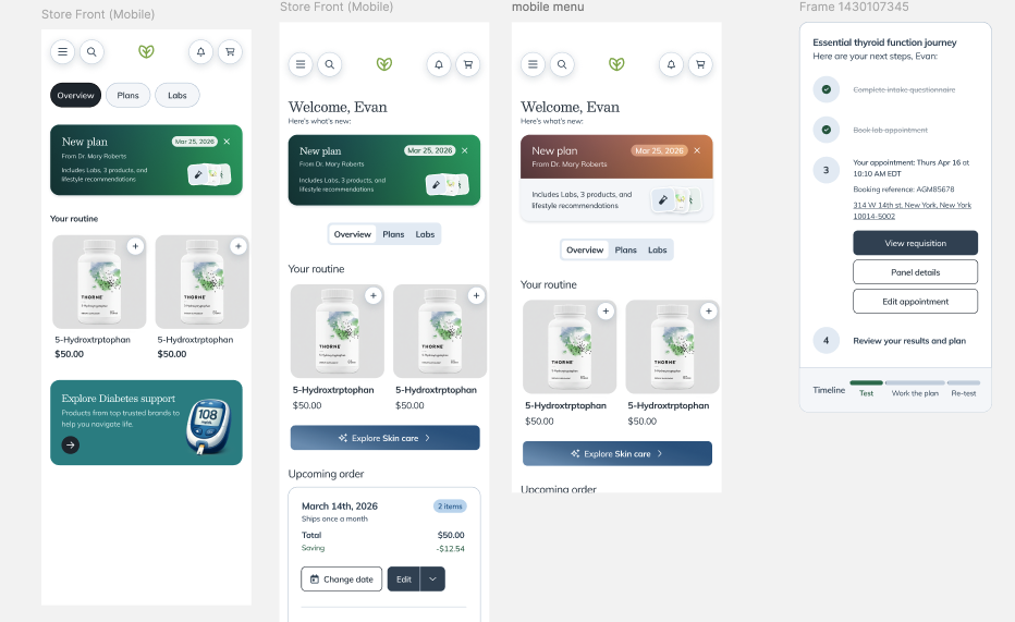
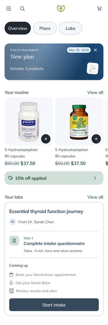
Before: Fragmented My Health
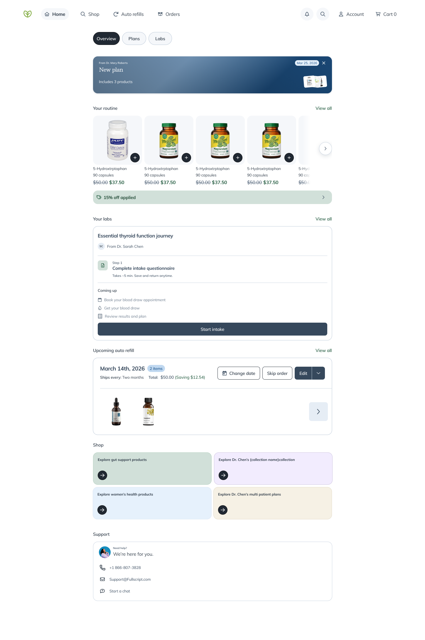
After: Centralized Overview
Problem
After login, patients landed on the catalog — 'here's everything you can shop' — when most actually needed their provider's plan. Repurchasers had no natural re-entry point. The fragmentation hurt both 0→1 and 1→2 conversion.
Approach
Built a net-new overview page as the answer to 'what's next for me?' — notification carousel, personalized card sets, and promotional placements. Deliberately additive; no nav restructure.
Outcome
1→2 order rate jumped 5.5 points. 0→1 TP conversion lifted ~0.8 points (~$1M/month). Patient LTV up 3%.
1→2 Order Rate
Repurchase conversion lift
Context & Problem
Business Context
Fullscript needed to grow patient LTV through 0→1 conversion on new treatment plans and 1→2 repurchase behavior. The existing landing experience worked against both goals.
User Context
Patients with active treatment plans, returning customers looking to repurchase, and hybrid buyers who do both plan purchasing and catalog discovery.
Constraints & Complexity
Goals & Success Metrics
Objective
Create a unified landing experience that serves plan patients, repurchasers, and hybrid buyers — increasing both 0→1 and 1→2 conversion.
Success Criteria
- Lift 0→1 TP conversion within 7 days
- Increase 1→2 order conversion among returning patients
- Increase hybrid buying behavior (plan-only buyers purchasing from catalog)
+5.5pts
1→2 Order Rate
+$1M/mo
0→1 Revenue
+3%
Patient LTV
Approach
Problem Mapping
Traced the patient journey post-login. Plan patients got lost in catalog. Repurchasers had no re-entry. Hybrid buyers saw no acknowledgment of both behaviors.
Surface Design
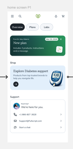
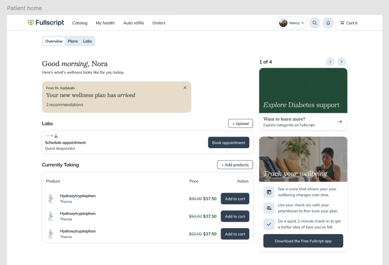
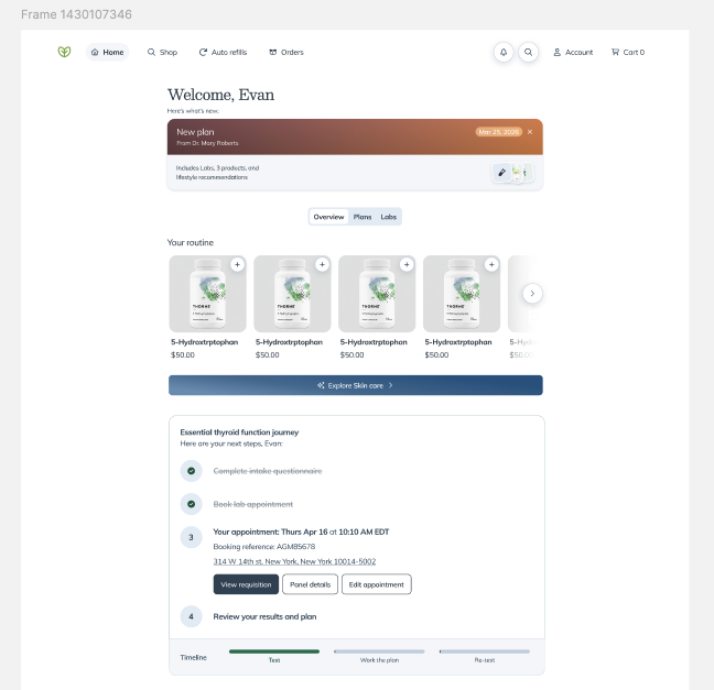
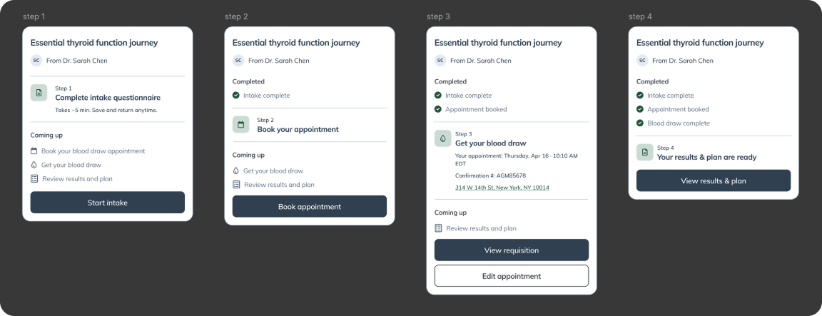
Built centralized overview as net-new URL. Notification carousel at top, personalized cards adapting to catalog access, promotional placements for app/Quality/Support.
Personalization Logic
Open-catalog users see Gut Health + categories + practitioner favourites + MPPs. Closed-catalog users see focused subset.
Consistency Moves
Renamed 'Currently Taking' → 'Routine' to match native. Moved Community Plans to catalog/homepage so Plans tab regained focus.
Experiment Setup
Store-level 50/50 experiment for clean measurement of conversion and hybrid buying impact.
Key Decisions
Critical choices that shaped the final solution
Decision
Built overview as an additive surface at a new URL. Deliberately scoped out nav changes, Journeys, and mobile app.
Tradeoff
Faster to ship and measure, but required careful linking to make the page discoverable.
Decision
Ported the notification infrastructure already proven on native mobile. Started with 'new plan created' with room to expand.
Tradeoff
Leveraged existing system but required cross-platform alignment.
Decision
Open-catalog users see category browsing + favourites. Closed-catalog users see a focused subset relevant to their provider's curation.
Tradeoff
More complex content logic but each patient type sees relevant next steps.
The Solution
A centralized overview page answering 'what's next for me?' with three coordinated surfaces: notification carousel, personalized card sets, and promotional placements for adjacent experiences.
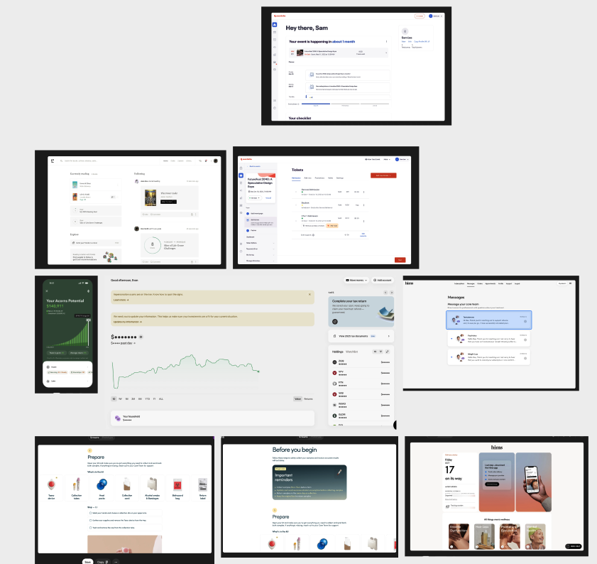
Competitive Analysis
Mobile Exploration
Mobile Exploration
Desktop Exploration
Desktop Exploration
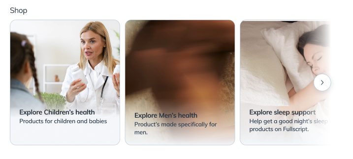
Shop Categories
Mobile Variations
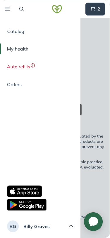
Before: Navigation
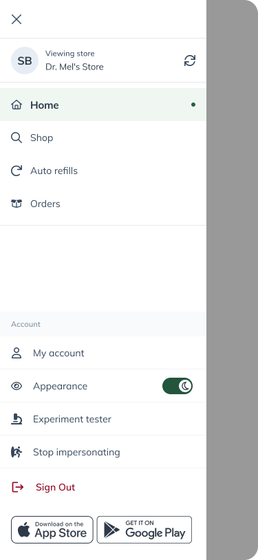
After: Navigation
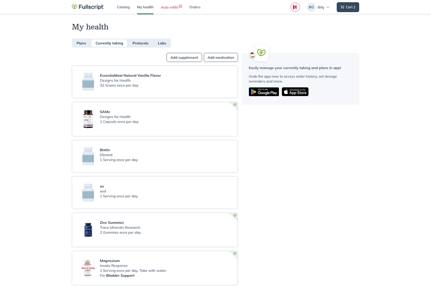
Before: Currently Taking
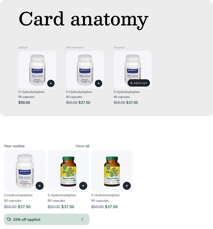
After: Card Anatomy & Routine
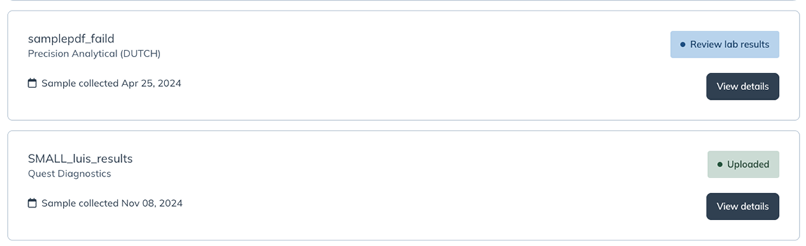
Before: Labs
After: Labs Journey
Final: Mobile
Final: Desktop
Outcomes & Impact
1→2 Order Rate
Jumped from 22.5% → 28% — a ~24% relative lift among returning patients
0→1 Revenue
0→1 TP conversion lifted from 51.8% → 52.6%. Small percentage, massive dollars at scale.
Patient LTV
Compounding effect of higher 1→2 conversion and stronger hybrid purchasing
Business Impact
Validated that landing surface design is a growth lever, not a UX polish item. The overview is now the team's highest-leverage surface for future LTV experiments — notification additions, new card categories, personalization tuning all compound against this baseline.
User Impact
Patients no longer get dumped into the catalog. The overview acknowledges their relationship with their provider and surfaces relevant next steps immediately.
Learnings & Reflection
App downloads post-first-order rose significantly. The overview's mobile-app placement turned a missed moment into a reliable acquisition channel.
Seven-day AND 30-day conversion moved on the same redesign — proving the surface works for both immediate and delayed action.
The deeper outcome: this page now functions as a distribution channel for adjacent surfaces (mobile app, Quality store, support).